Design Projects for Actors and Singers, and the Tourism Trade
Consultancy, Curation, and Visual Identity for Artists, Cultural Institutions, and Corporate Sectors
SELECTED WORKS
The gathered archive integrates visual communication, editorial materials, and multilingual localization in a centralized delivery without intermediaries, reflecting the technical and aesthetic rigor applied to every demand.
Case Study #1 | Design for Instagram
This project showcases the transposition of the International Typographic Style (Swiss Design) to the social media landscape. The objective is to establish a mature reading standard for the art and culture segment, moving away from disposable digital content to deliver value and authority to prestigious brands and personalities.
The structure relies on three-slide sets that utilize the graphic space continuously and panoramically. Here, text and image operate under the same mathematical logic: the copywriting is calibrated based on character limits to prevent grid breaks, while keywords establish precise visual and conceptual connections with the scene elements.
Typographic Architecture and Textual Control
The project’s identity unfolds through a hybrid typographic system, designed for legibility and impact on digital interfaces. The headers utilize a sans-serif typeface with condensed proportions and geometric design, lending vertical weight and architectural presence to main titles. The body text features a highly legible sans-serif family optimized for crisp screen rendering, which is essential for complex micro-typography layouts.
For the carousel layouts, a square serif slab typeface was intentionally introduced. This calculated disruption interrupts the standard aesthetic of social platforms and restores the tactile weight and sophistication of printed editorial catalogs.
Each paragraph is treated as a geometric block integrated into the grid, where tracking and character volume are rigorously adjusted to eliminate isolated orphan words and ensure static layout equilibrium during the swipe motion.
Study I - From Point to Pixel
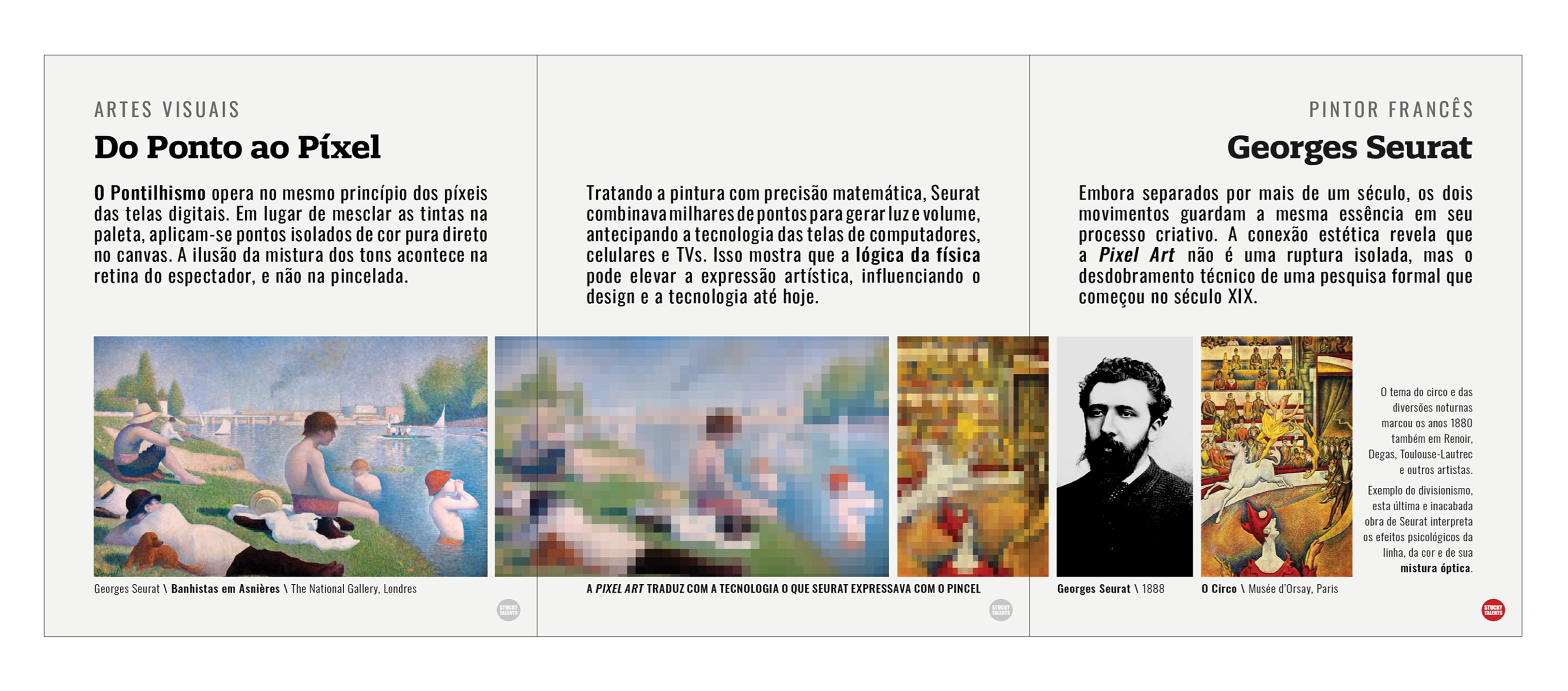
The first carousel establishes a direct relationship and formal evolution from Neo-Impressionism to Pixel Art. The layout adopts an asymmetric grid that allocates 40% of the screen to the upper text block and 60% to the visual baseline. The white filling isolates the content and creates a moment of silence on the platform.
Sequential static images cross the slice line of the slides. The progression of Seurat’s two reproductions—one in high definition and the other pixelated—leads the viewer to understand the comparative message directly. The screens are fragmented by time but fully unified through the concept of “small points.” This resolution gradient functions as an ocular induction vector, guiding the gaze toward the swipe gesture until the third frame, where the image stabilizes.
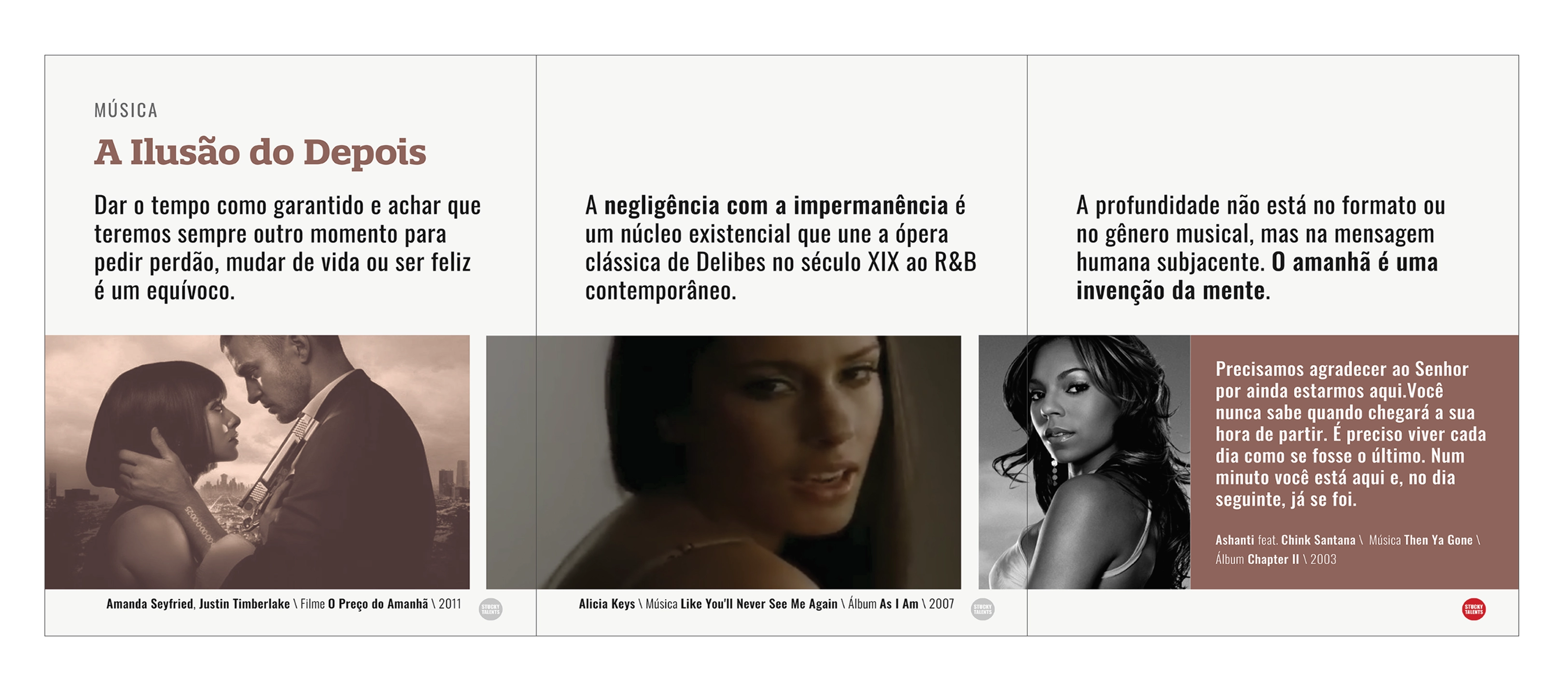
Study II -The Illusion of Later
In the second carousel, the page geometry organizes chronology and space to address impermanence through references in music and cinema. An asymmetry occurs in the third area via a solid terracotta-colored box, which acts as a visual barrier at the close of the horizontal reading, counterbalancing the title’s weight placed at the start.
The motion engineering utilizes an autoplay video (without control buttons) in the lower half, operating like a filmstrip. The media challenges platform constraints by crossing the slice line of the blocks: the video emerges fragmented on the first slide and reveals itself almost completely only on the next. This strategic positioning subverts traditional format aesthetics, using the physical swipe motion as a necessary element to unfold and consume the media in real time. The playback runs continuously in an exact countdown: 2011, 2007, and 2003. As the user drags the elements, the animation matches the rhythm of the written message about the passing years through transitions in luminosity and shot proximity: starting with a high-contrast daytime exterior scene, moving to a medium studio frame with diffused light, and concluding with a black-and-white close-up.
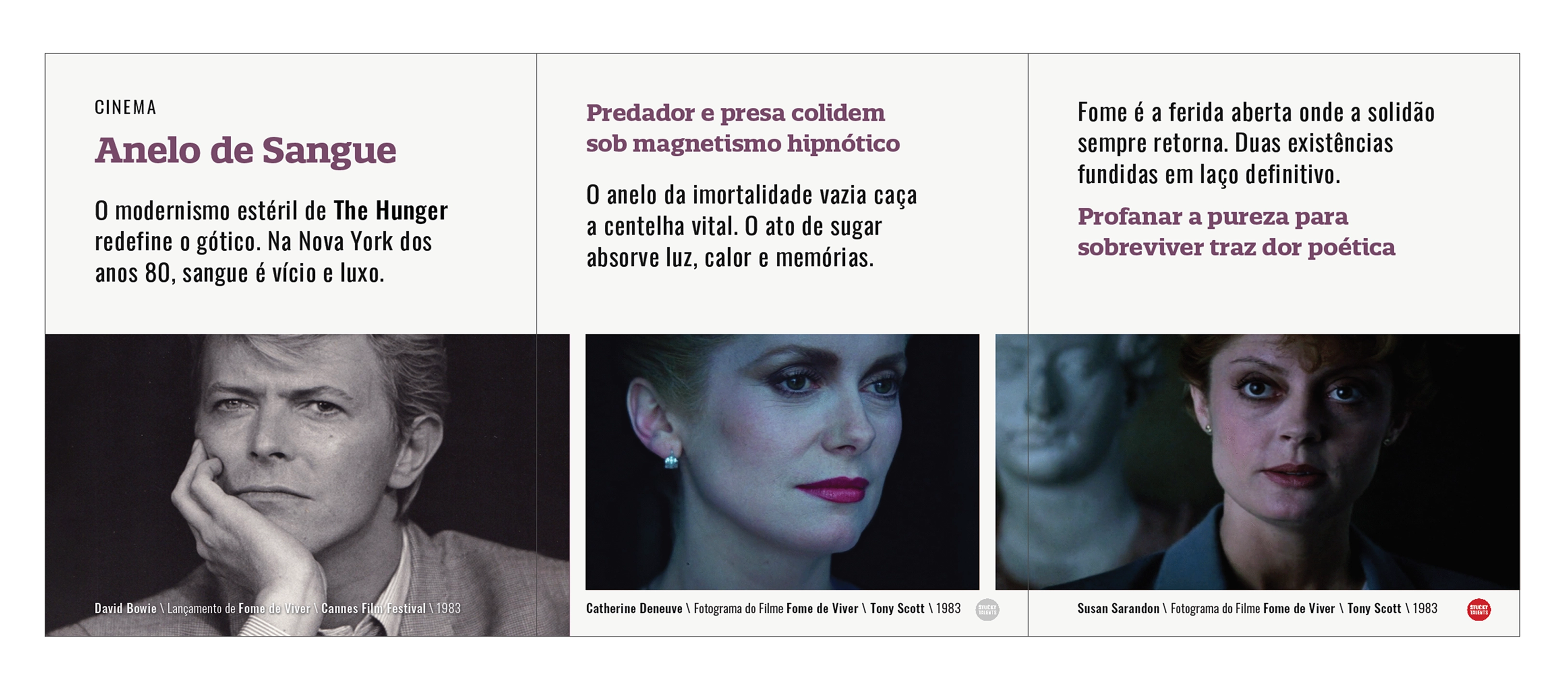
Study III - Blood Yearning
The third carousel graphically manifests the tragic response to the anxiety of impermanence addressed in the previous study. The narrative relies on the film The Hunger to explore the price of the gothic pursuit of immortality and the vacuum of eternal solitude. Visually, the structure maintains the rigid proportional division of the grid, organizing a horizontal sequence of close-up portraits that document the transformation of the characters.
The typography breaks the monochromatic neutrality and assumes the hue reserved for the Cinema category within the visual identity system. This intentional chromatic contrast not only guides the swipe motion toward the final slide but also acts as the conceptual closure of the project’s reference ecosystem, consolidating the message and audience retention in a purely subliminal manner.
The objective is to demonstrate that cultural density and textual control are the most effective tools for subliminal message retention.
In the first instance, the formal evolution spans from Neo-Impressionism to Pixel Art. In the second, time barriers are shattered to demonstrate that, nearly a century and a half later, nineteenth-century opera by Delibes and contemporary R&B share the same existential core regarding the urgency of life.
This semiotic web extends to the third instance through the film The Hunger, whose opening features the band Bauhaus, connecting Delibes’ music to the gothic universe and the tragic pursuit of immortality in the face of impermanence. The result proves that cultural density and textual control are the most effective tools for subliminal message retention.
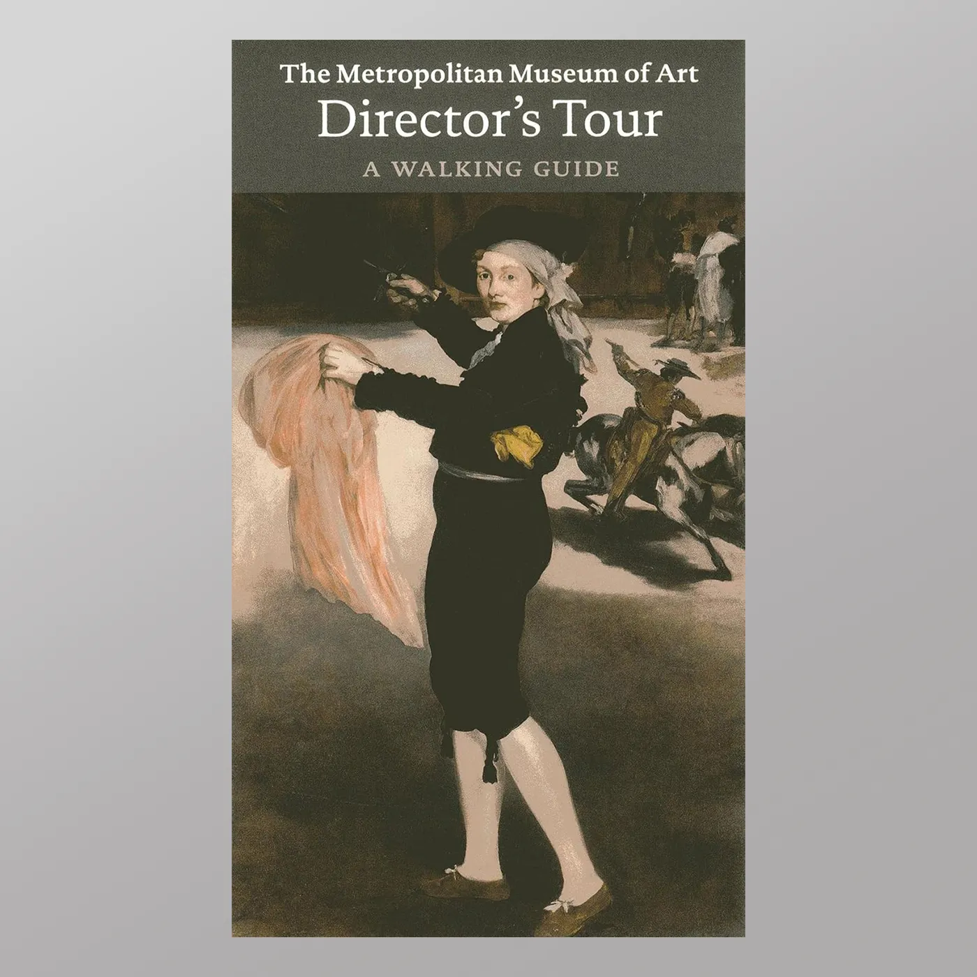
The Metropolitan Museum of Art - Director's Tour - A Walking Guide
Portuguese Translation of the Director's Tour - A Walking Guide


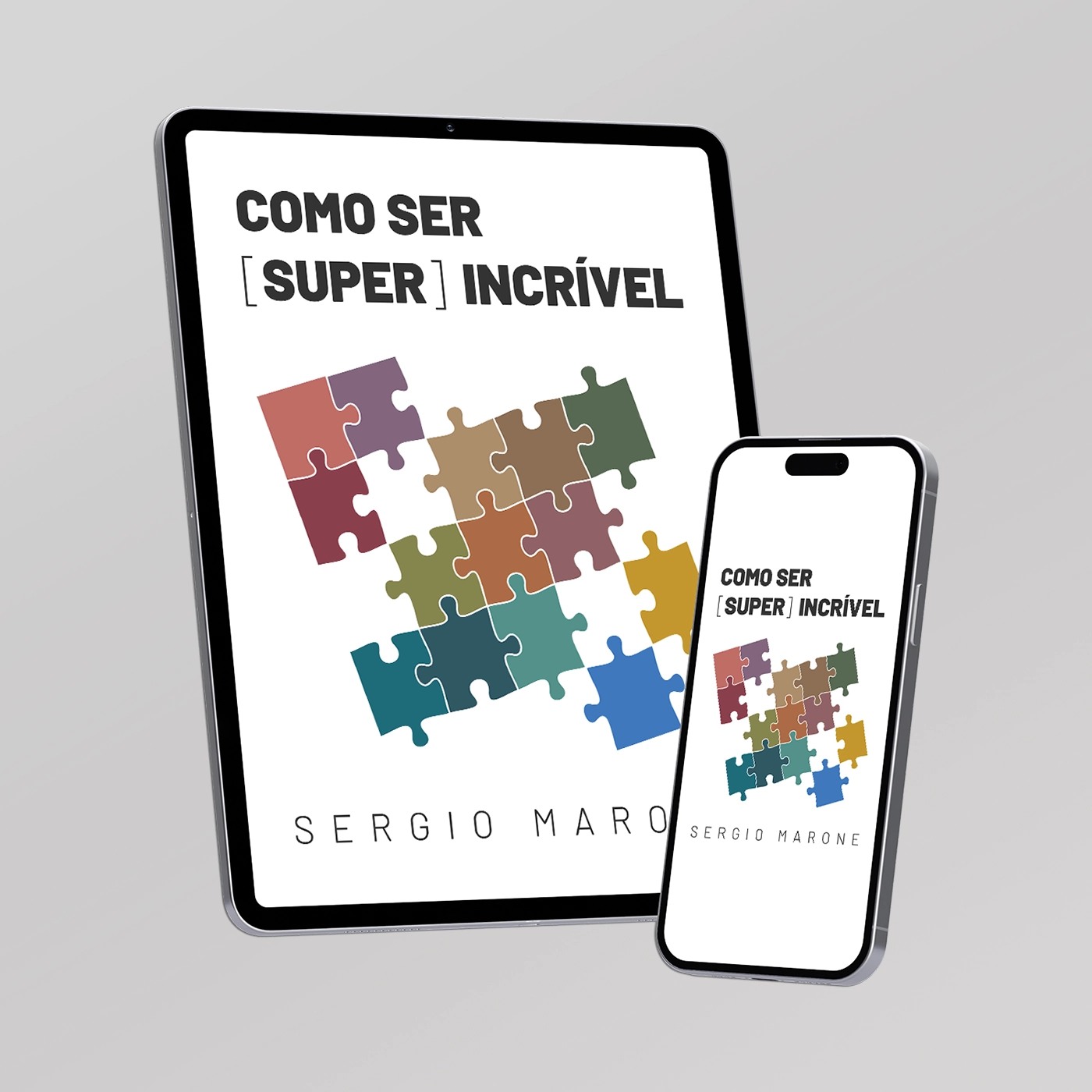
![eBook Como Ser [Super] Incrível by Sergio Marone. Conception, Design, Editing and Publishing by por Stucky Talents.](https://www.stuckytalents.com/wp-content/uploads/2026/07/CSSI-1-770x770.webp)